2026 · AI TOOLING
I ran a controlled test on an anti-AI-slop design tool
Two briefs, four pages, one control. The full method behind the Field Test piece on Hallmark — including the measurements and what I couldn't verify.
This is the working companion to a piece I published on Field Test, my newsletter. That one is the readable version. This is the method, the raw numbers, and the parts that were too in-the-weeds to belong there.
The short version: Hallmark is an open-source "design skill" you install into an AI coding assistant. It claims to stop the assistant producing websites that look AI-generated. I wanted to know whether that claim survives a controlled test rather than a vibes check.
The design of the test
The thing that makes most tool reviews worthless is that the reviewer reads the marketing before producing the baseline. You cannot un-read a list of anti-patterns. So the order mattered more than anything else here:
- Write two baseline pages having read nothing but Hallmark's one-line description.
- Only then read the rules, install the skill, and rebuild the same two briefs.
- Compare, and measure rather than eyeball.
Two briefs, chosen to be as far apart as possible while both being plausible real jobs:
- Brief A — a B2B invoice-automation SaaS for small finance teams.
- Brief B — a small-batch clothing label in Porto, six garments a season, made from deadstock fabric.
If a design tool has one shape underneath it, two briefs this different will expose it.
What the baselines looked like
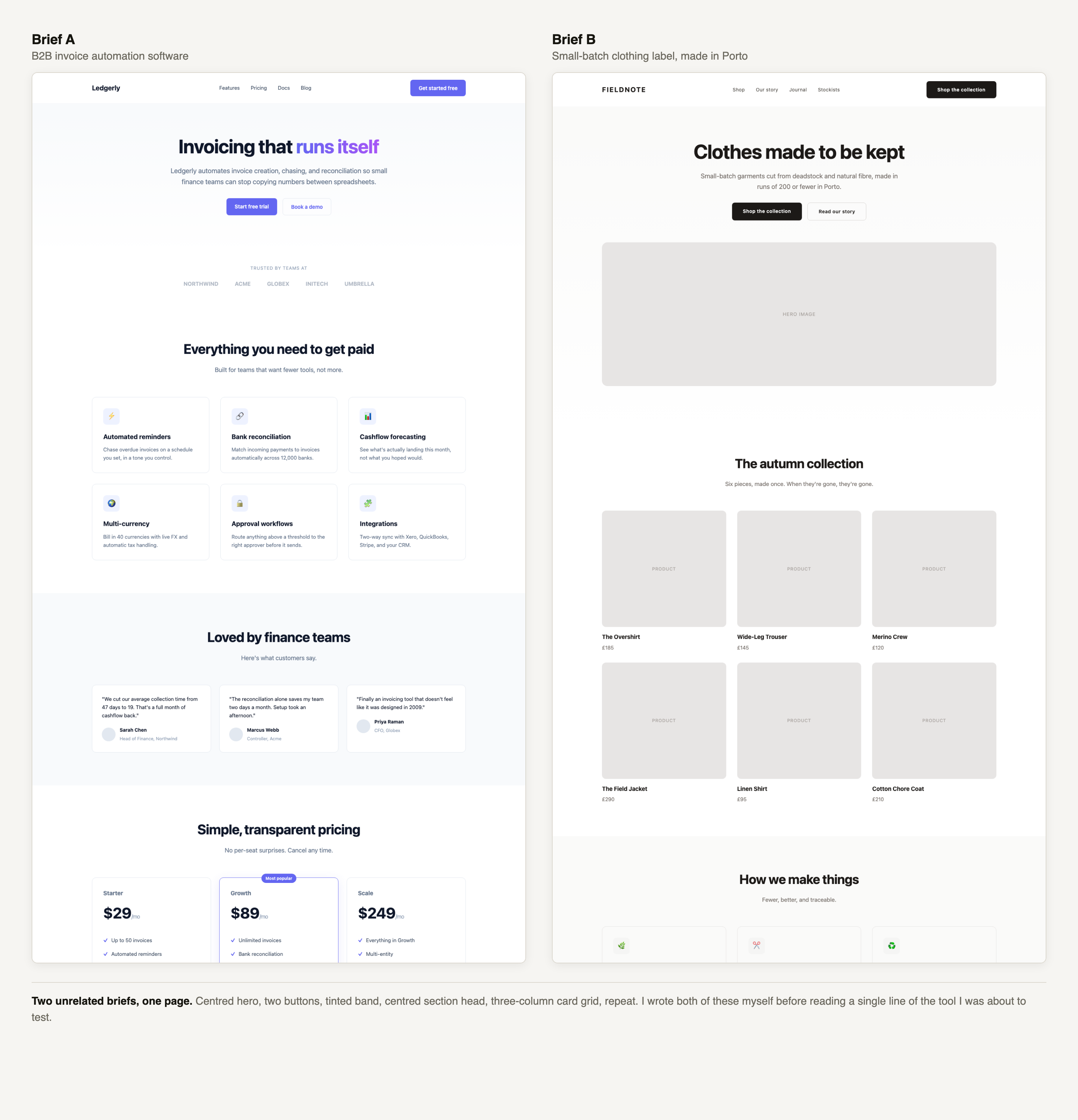
Identical skeletons. Centred hero, two buttons, tinted band, centred section head, three-column card grid, second three-column grid, dark CTA slab, four-column footer.
Scored against Hallmark's own named anti-pattern list, my baselines hit around ten of them, including:
- the purple-to-pink gradient poured through the headline
- a full-viewport centred hero
- the three-column icon-card grid
- emoji standing in for icons
- the four-column "Product / Company / Resources / Legal" footer
- placeholder companies named Acme and Globex
- invented metrics
That last one turned out to be the interesting part.
What the rebuilds looked like
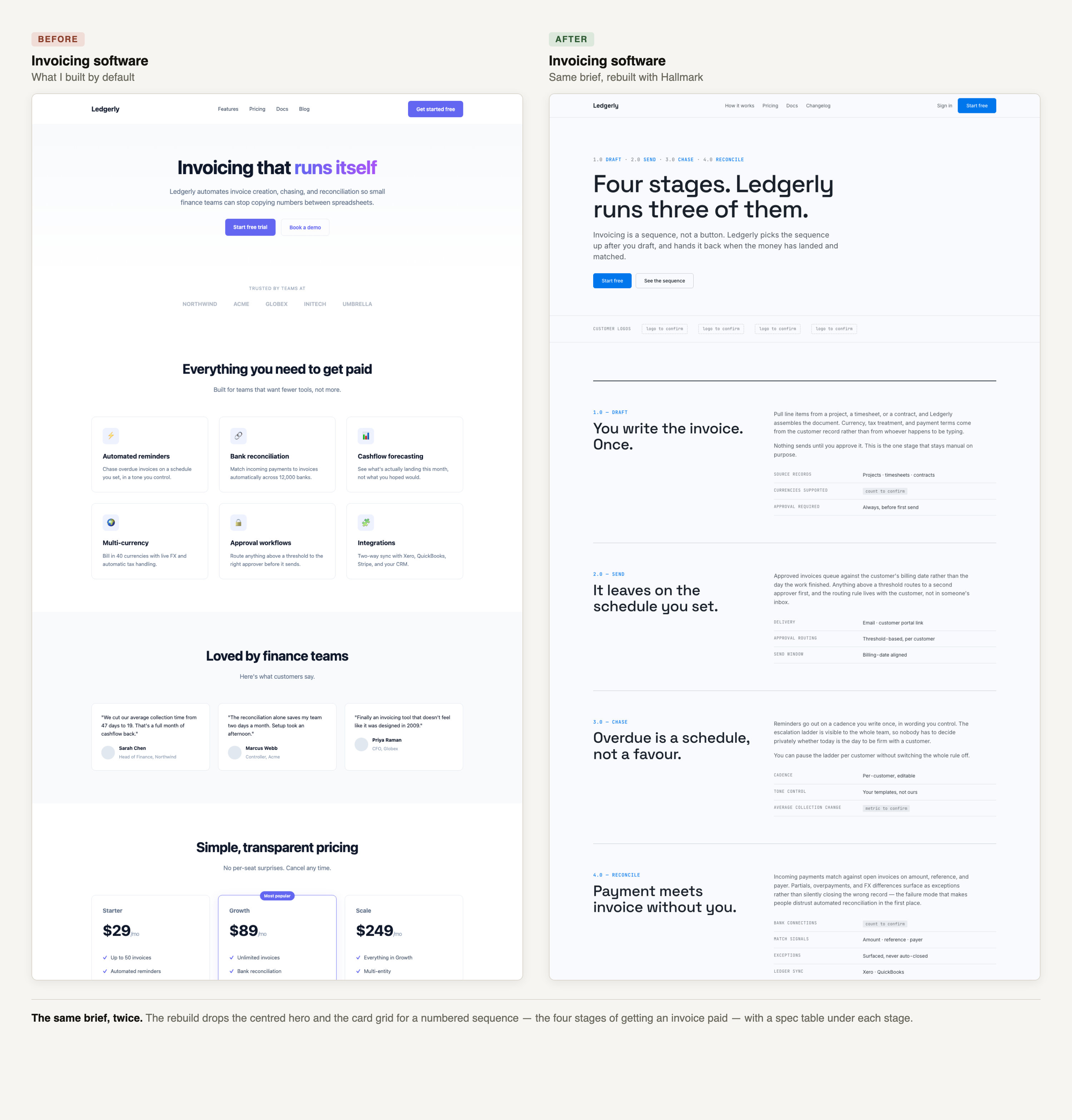
count to confirm and metric to confirm placeholders in the rebuild.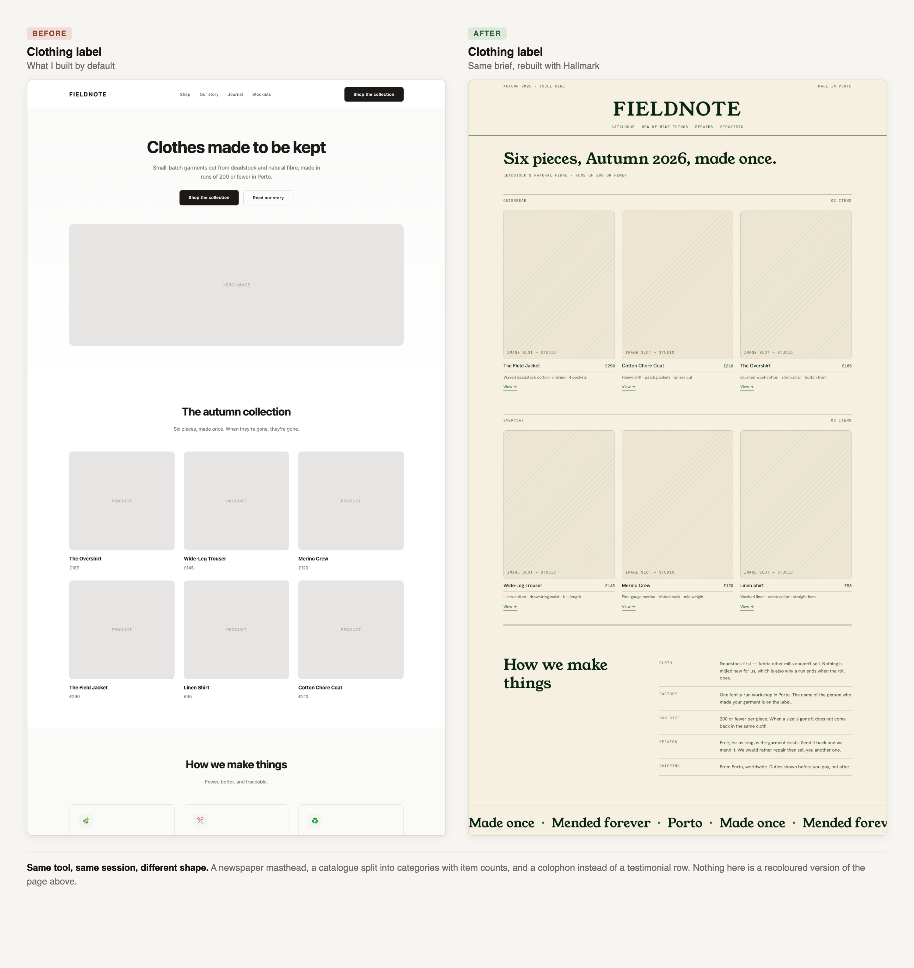
The invoicing page became a process: four numbered stages tracking an invoice from draft to reconciliation, each with a small table of specifics. The clothing page became a catalogue under a newspaper masthead, split into categories with item counts, closing with a colophon instead of a testimonial row.
Structurally distinct, and neither resembles what I'd written by hand an hour earlier. That was the claim, and it held.
How it does it
Worth understanding, because the mechanism is more interesting than the output. Hallmark is not code. It's a folder of markdown files — roughly 100 of them — that the coding assistant reads before it designs anything. There is nothing to execute and no runtime.
The structural variety comes from forcing an explicit, stated choice at three levels before a line of CSS is written:
- one of 21 named page shapes (the invoicing page took "Narrative Workflow", the clothing page "Catalogue")
- one of 20 named visual themes, each with a fixed OKLCH palette and font pairing
- separate navigation and footer archetypes, picked independently
Then a diversification rule: consecutive builds must differ on the page shape, and on at least one of three named axes — paper lightness band, display-type style, accent hue. My two builds differed on both display style and accent hue, which is why they don't read as recolours.
The clever part is making the model say the choice out loud before building. Left to itself it collapses toward the same attractor every time. Being made to name the pick, and name what it differs from, is what breaks the default.
The measurements
I checked horizontal overflow at a narrow viewport, since responsive discipline is a claim that can actually be tested rather than argued about:
- Baseline, invoicing: 120px of horizontal overflow — the page scrolls sideways
- Baseline, clothing: 72px
- Both rebuilds: 0px
Caveat worth stating: headless Chrome clamps its minimum viewport to 500px, so this was measured at an effective 500px rather than a true 320 or 375. The baseline failure is real at that width regardless, and would be worse narrower.
The finding I didn't expect
My baseline invoicing page asserted, unprompted, that the product reconciled payments across 12,000 banks, that a customer had cut collection time from 47 days to 19, and that it was trusted by 4,000 teams. It also carried three testimonials attributed by name and job title to people who do not exist.
I supplied none of those numbers. There was a slot shaped like a statistic, so the model produced a statistic — the same slot-filling reflex that produces the three-column grid, aimed at facts instead of layout.
Hallmark forbids this. Rebuilt, the same slots came back as labelled placeholders — count to confirm, metric to confirm — rendered as small grey blocks sitting in the page waiting to be filled. The testimonial section wasn't faked with better names; it was dropped, on the reasoning that a proof section with no proof is the wrong section.
For anyone shipping a real company's site with AI assistance, I'd argue this matters more than the visual variety. Design sameness costs you distinctiveness. A fabricated statistic on your own landing page is a different category of problem, and it's much harder to catch, because an invented number looks exactly like a real one.
What I couldn't verify
Stating this properly rather than leaving it implied:
- I tested against empty directories, not an existing codebase. Hallmark has a whole pre-flight routine for detecting and preserving an existing font stack, palette and spacing scale. None of that was exercised. It is also where I'd expect a tool like this to be most likely to misbehave.
- I ran one assistant, not three. Behaviour on Cursor and Codex is untested by me, and there's an open issue suggesting the Cursor install instructions are wrong.
- Two briefs is a small sample. It's enough to falsify "it only has one shape". It is not enough to prove the variety holds across twenty builds.
Two criticisms
The quality gate is self-graded. Hallmark closes each build by running the output against a checklist and reporting a score, typically "58 / 58 ✓". The model is grading work it produced a minute earlier. That is a self-assessment in the costume of an audit, and it will be read as a guarantee by exactly the people least equipped to know it isn't one.
The count is wrong. The instructions ask for a score out of 58; the list contains 57 gates. Trivial in itself, already logged as an issue by someone else — but it appears on every build, and it neatly illustrates the point above. Nothing external is checking, so nothing external caught it.
Verdict
TRY, if you already build with Claude Code, Cursor or Codex. One command, MIT licensed, no executable code, and the improvement is not subtle.
WATCH if you don't. The ideas travel further than the implementation — particularly the honest-copy rule, which I expect to be borrowed widely.
The most valuable thing in it isn't the twenty themes. It's the short list of slots the model is told to leave empty. That's worth stealing whether or not you ever install it.